[001]
Brand Identity
2026
LAPS New Identity
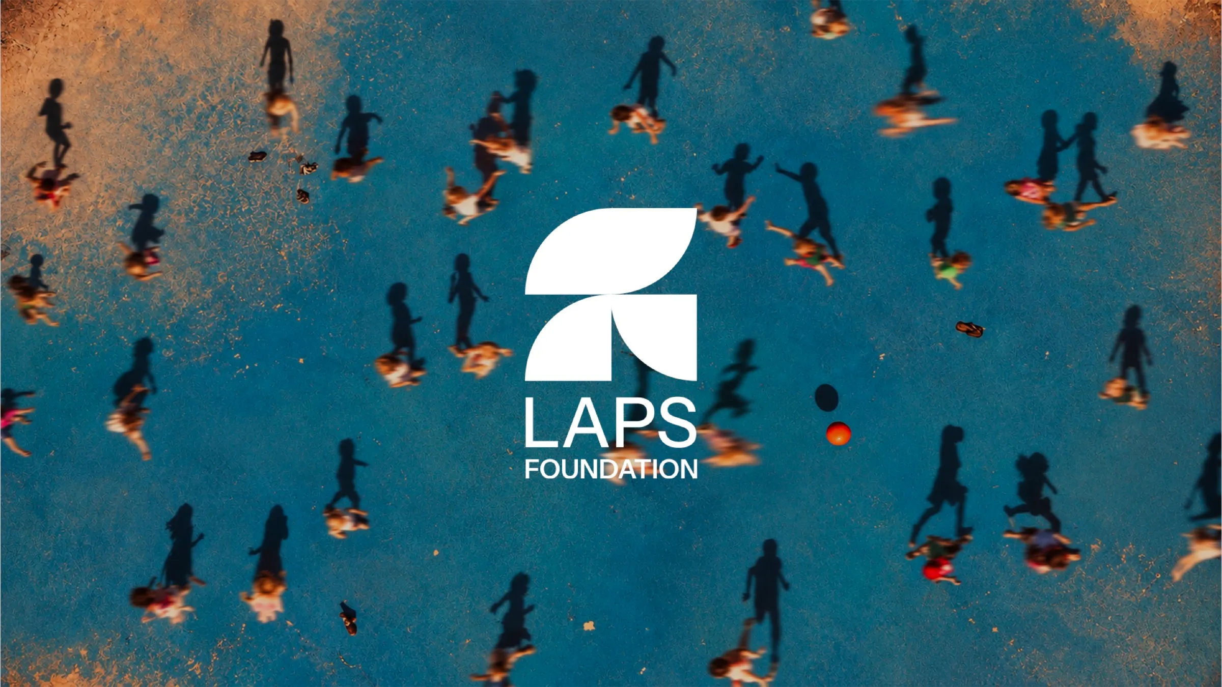
Building the future, piece by piece. A project is something that is imagined, drawn and built. That is exactly what the Foundation does: it starts from a concrete need and builds, step by step, new possibilities for the children and young people it supports.
[01] Concept
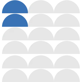
The identity follows the same principle: a modular system made of a few essential elements that fit together.
[02] Values
The first step was to understand what the Foundation stands on. Four values emerge from its work, expressed as verbs because LAPS is defined by what it does.
Lay, to put the groundwork in place. Act, to step in. Participate, to build together. Shelter, to protect. They are the four pillars of the brand, and their initials spell its name.



[03] Logo
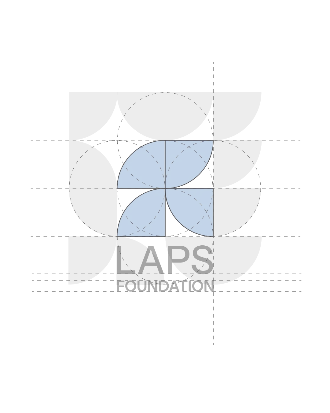
To give them a shape, the system starts from the circle, which stands for the whole: the Foundation in its entirety.
The circle is divided into four quarters, one for each pillar. Each quarter is a module in its own right, but it comes from the same figure and shares the same geometry as the others. That is why the modules always fit together, like the values they represent.
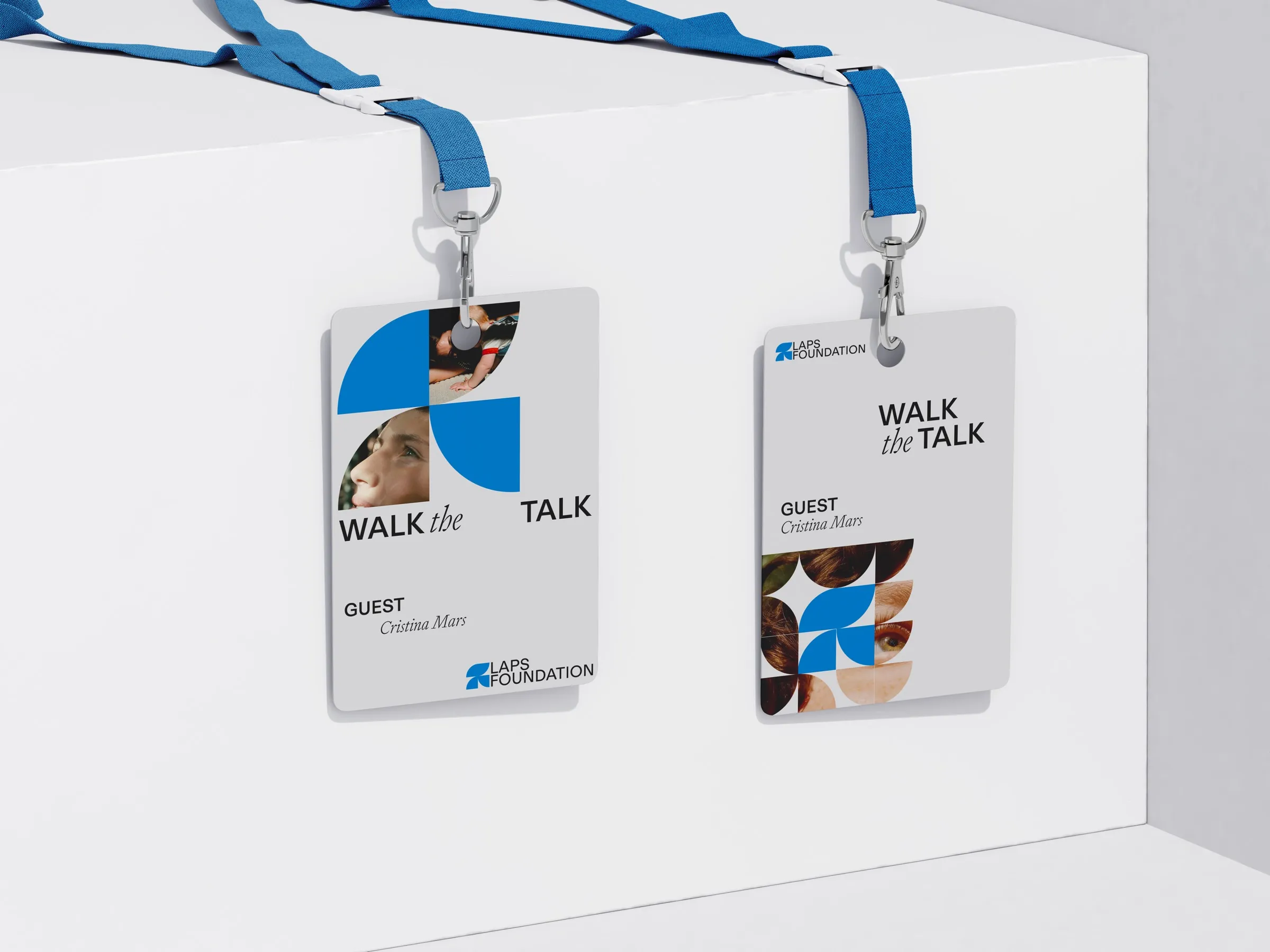
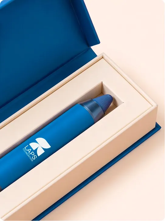
The logo is the moment the four pillars come back together. The quarters leave the closed form of the circle, rotate around the centre and recompose into a new mark. A circle is still and complete, while the logo is open and has a direction. The rotation gives it movement, because the pillars are actions.
The composition rises from the bottom up, like everything that gets built: it is growth, the future the Foundation leads its young people towards. Four distinct actions, one direction.

[04] Impact
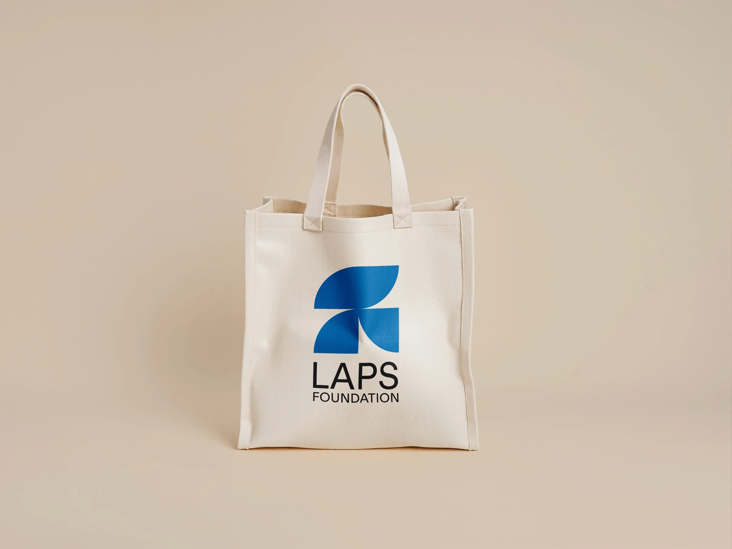
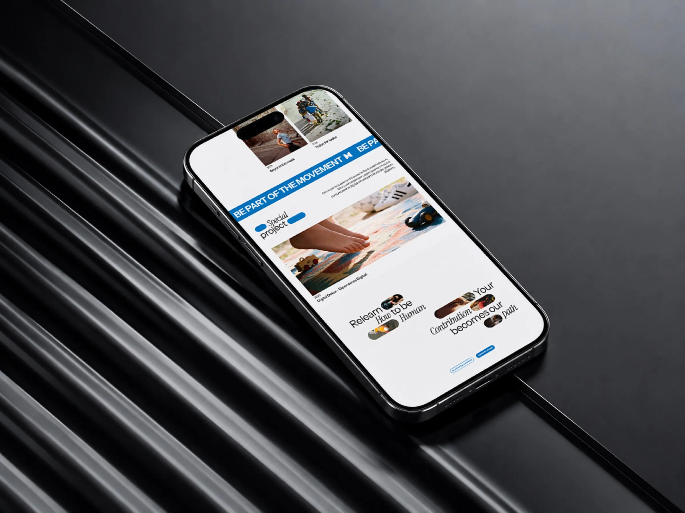
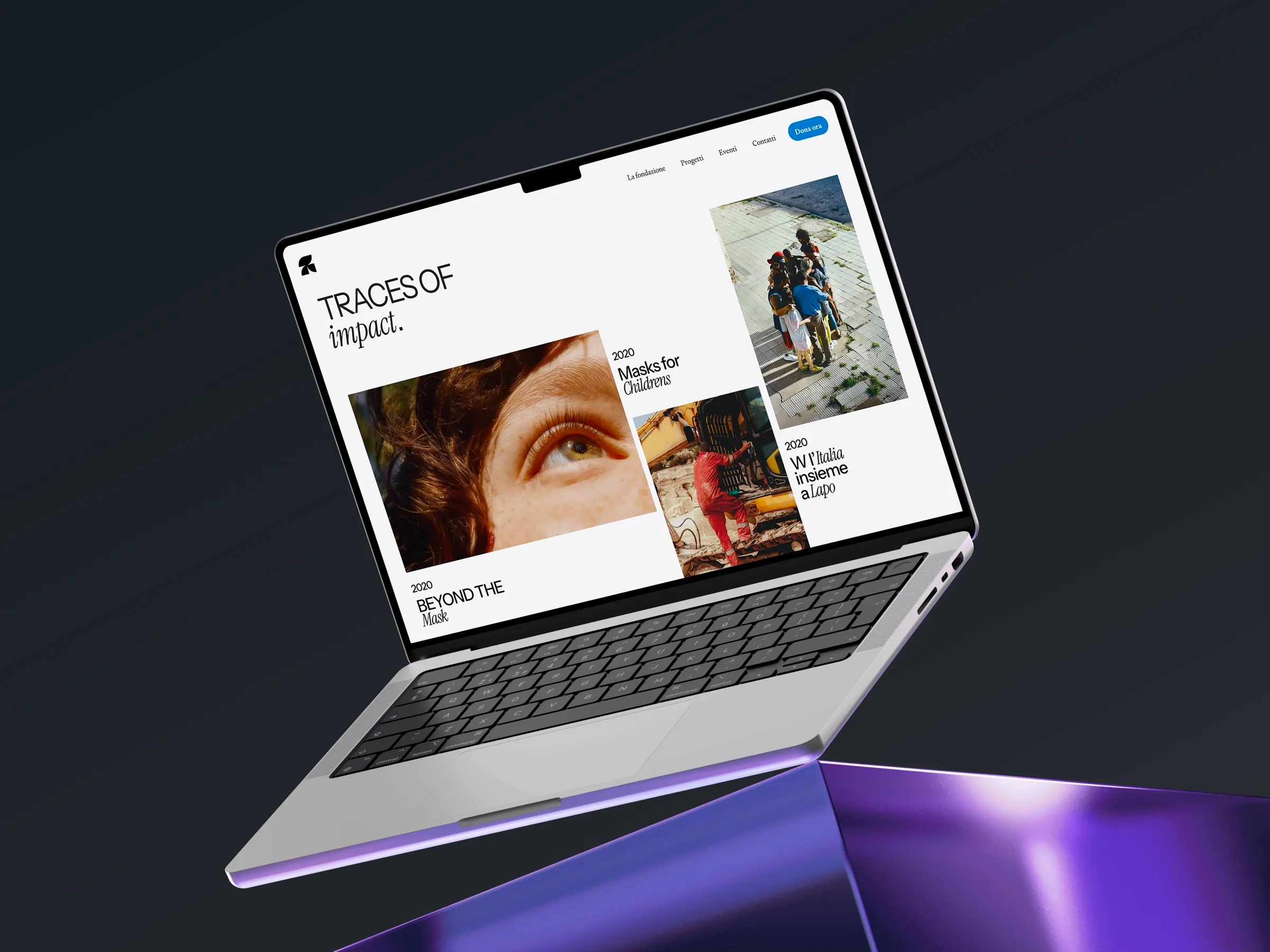
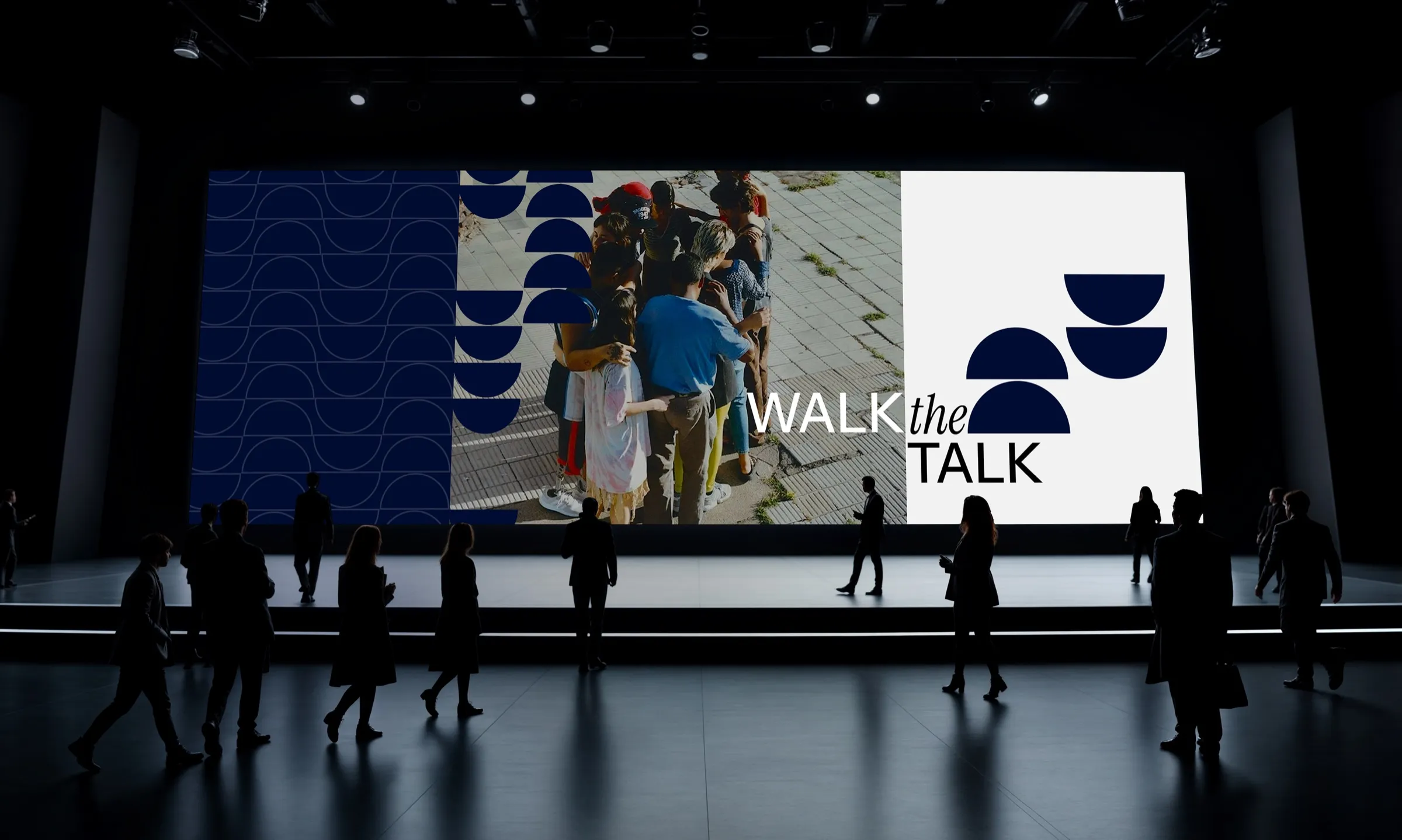
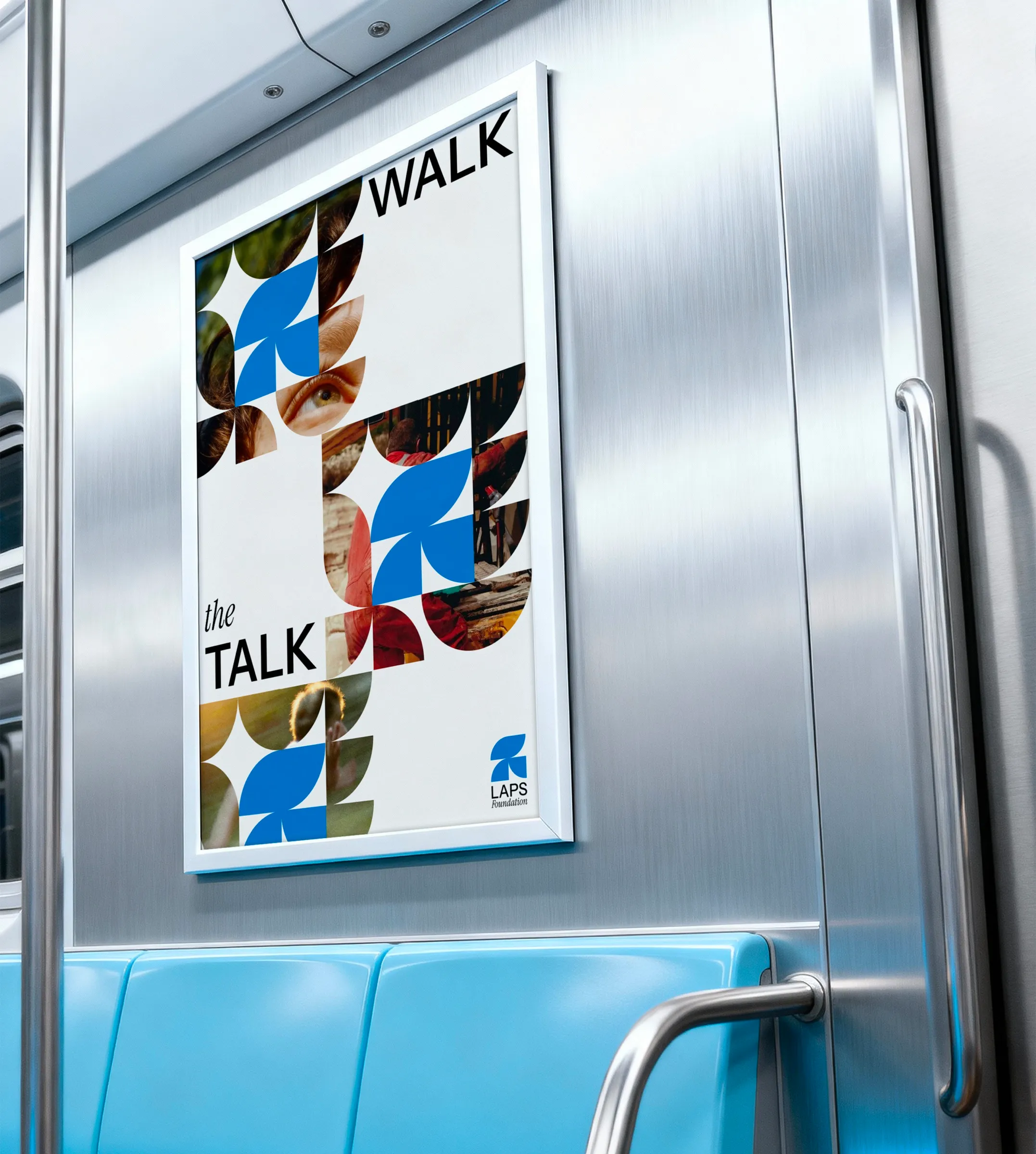
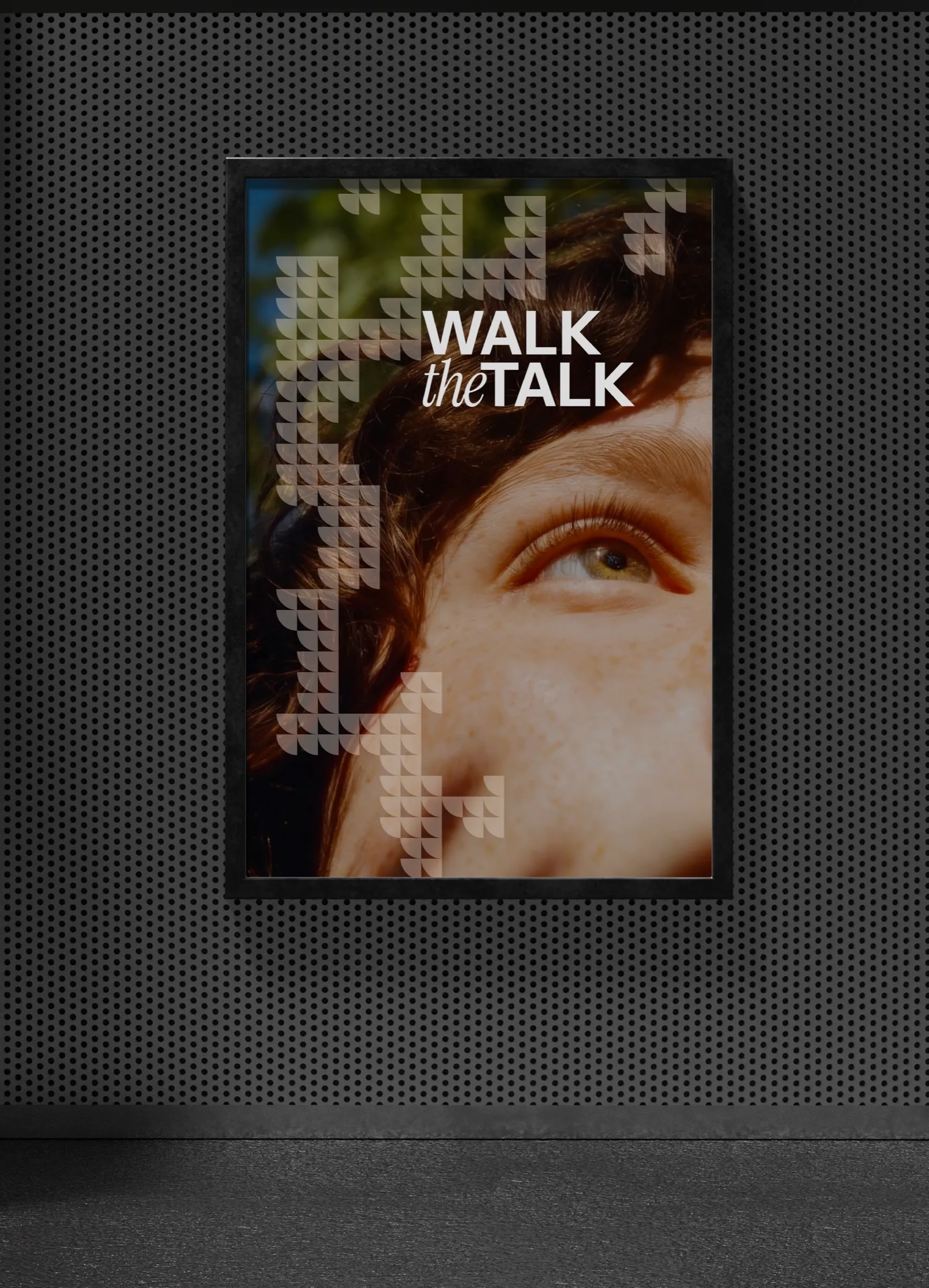
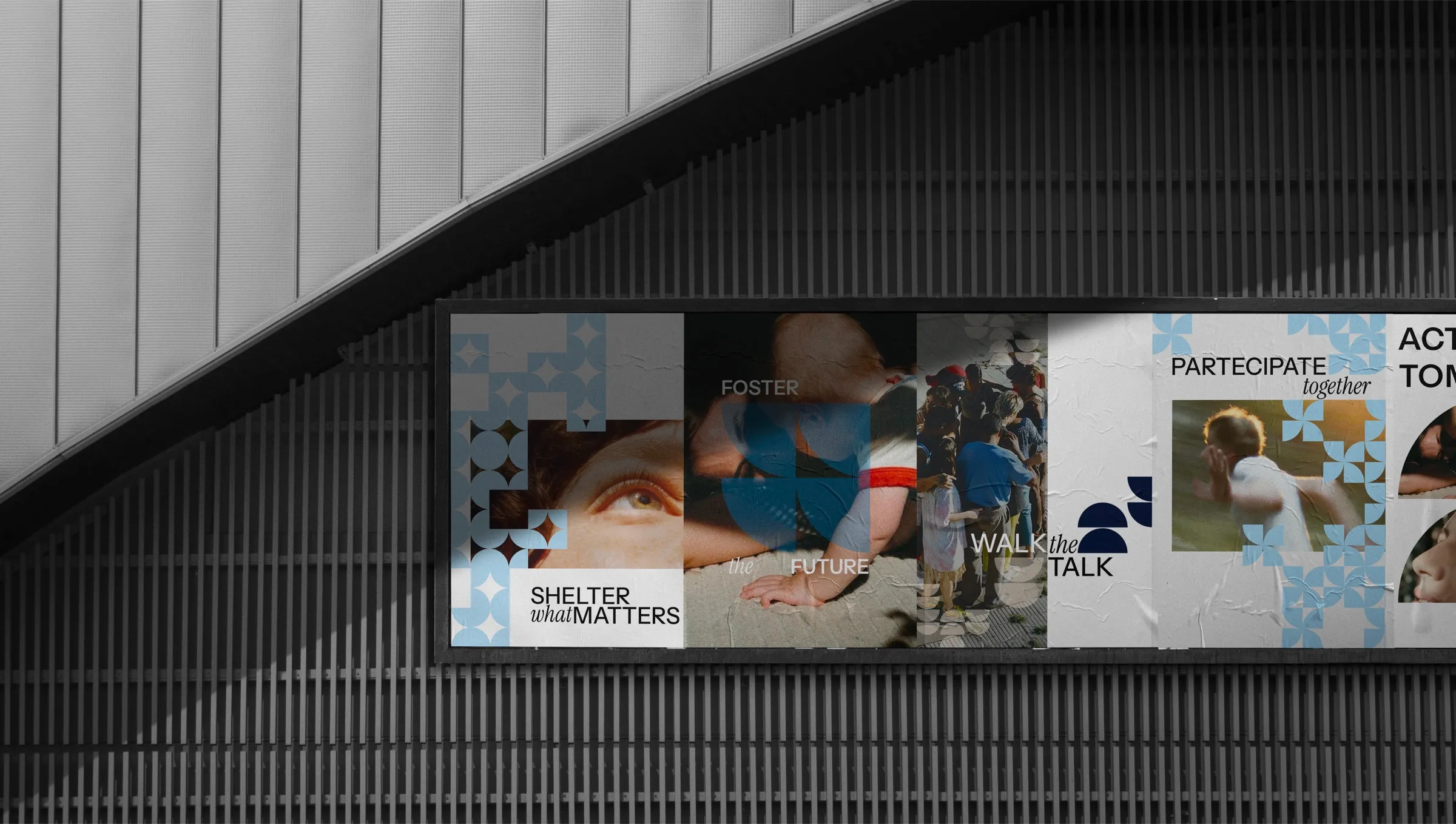
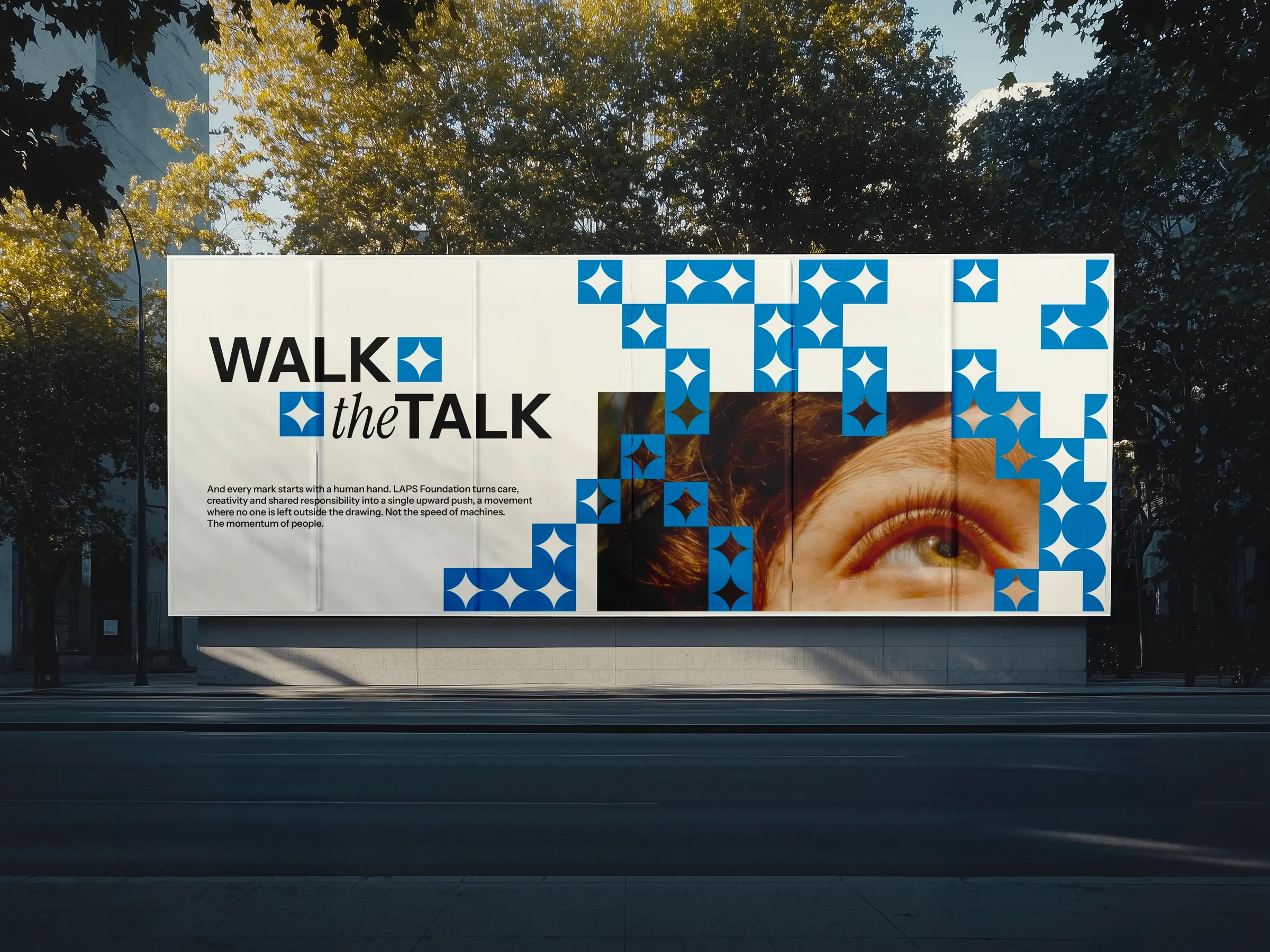
The brand becomes a space under construction, one that makes the Foundation's impact visible.
[05] Credits
- Agency
- Publicis Sapient
- Art Director & Graphic Designer
- Roberta Florian
- UX/UI Designer
- Erika Conversano
- Creative Experience Supervisor
- Andrea Baldin
- Project Managers
- Sofia Fusilli, Chiara Prevosti